Normal maps have been around since the late 90s, and are most commonly used in the video game industry. They are RGB rasters that, instead of texture information, record the xyz components of the surface normal they are wrapped onto. A surface normal is a vector with length 1 that is perpendicular to a surface; it "points" in the direction that the surface at that spot is facing.

An extremely low-resolution terrain. The surface normals are the short white lines at the center of each polygon. They point in the direction the polygon is facing. For example, the normal to the dark polygon at top center has components 0.504, -0.001, 0.863 (that is, the normal points 0.5 units east, a negligible amount south, and 0.86 units up; the overall length of the normal is 1 unit).
Why would you want to make an object's geometry into a texture? Because you can then simplify the geometry, but keep the high-resolution normal map, and then use the normal map to drive the shading of the object at render time. The object looks detailed without all the resource costs of being detailed. This is great for a video game, where you want objects to look very detailed and render at least 20 times per second.
Maps usually don't need to be rendered many times a second, so normal maps have, until recently, not been used much in cartography, but because they are a raster representing 3D surface orientation (NOT the same thing as aspect or slope), there are a number of things you can do with them to improve the look of your relief maps.

Shaded relief map of Graubünden, Switzerland.

A normal map of the same region, and its component RGB channels. Each channel records the x, y, or z component of the surface normal at that point. Normal maps are unsigned rasters, and can't have negative values. A component in the negative direction is therefore represented as black, in the positive as white, and as 50% gray if its length is zero. For example, a pixel in the red channel will be black if that pixel is a west-facing cliff, white if it's an east-facing cliff, and gray if it's facing up. Note how, in the blue channel, flat areas are white, and since any point darker than 50% gray would be pointed away from us (and underneath an overlying surface), there are none visible.
The first interesting property of a normal map is that you can treat them as a relief map from every possible lighting direction at the same time; each direction is a unique color. Making a conventional relief map is simply a matter of isolating one of those colors, as well as those similar to it. You can actually see this in the figure above; the red, green, and blue channels look like relief maps lit from the east, the north, and directly above, respectively.
Exercise 1
Here is a sample normal map you can use
This exercise truly isn't all that useful except in a few niche cases; many people using Photoshop for cartography will have plugins that can do relief shading already. However, this helps to develop an understanding of what a normal map is and serves as a foundation for many other methods that are difficult to use without normal maps. It also demonstrates a very useful property of Difference blending and adjustment layers, if you're not already using them.
If you want to quickly generate shaded reliefs on the fly in Photoshop and you have a normal map, you can make a grayscale raster based on similarity to the color of the faces you want fully lit, and it will essentially be a relief. This is similar to the method that standard analytical relief shading uses, although the math involved is not quite the same, so the gradation through the shades of gray is slightly different.
Unfortunately it's not as simple as using the Select>Color Range tool in Photoshop, because there is some asymmetry about the way that tool calculates similarity between colors. For example, if you sample perfectly flat, level areas to try to recreate the blue channel seen above, the resulting grayscale preview of your selection does NOT correspond to lighting from directly above (see below).
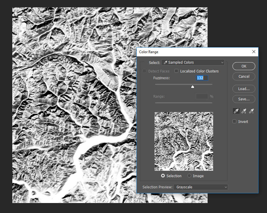
Even though the north-facing slopes should be just as different from the selected color as the south-facing slopes, Color Range does not treat them equally.
There is a method that avoids this problem, but it requires a few steps:
- Select the color corresponding to the pixel you want fully illuminated.
- Create a new layer and fill it with that color.
- Set the new layer's blending mode to Difference. What you'll see now is a map of how much everywhere else differs from the orientation of the pixel you chose. Desaturating and inverting this map will give us the shaded relief we're after. There's a problem though; what you're seeing is still a result of blending two layers, and needs to be made into a single layer before we can make those adjustments.
- Select the entire map and press shift+ctrl+C (shift+command+C on Mac), or choose edit>Copy Merged. This sends a flattened copy of your layer stack to the clipboard.
- Paste in place, and now you can desaturate and invert the difference map (both operations are under Image>Adjustments).

Your map might look something like this after Step 3. I sampled a color on one of the NW-facing slopes; notice how all NW-facing slopes are fairly dark. The more different a pixel's orientation from the location I sampled, the brighter it will be in this image. Converting this to a grayscale image and inverting it thus creates a relief map lit from the NW.
You still have your original normal map and the color fill in case you want to choose a different lighting direction. If you want to see the effects of different colors in realtime, and you're using Photoshop CS6 or later, you can use adjustment layers. Once you get to step 3 above:
- Group your normal map and your color fill layer.
- Add a Hue/Saturation adjustment layer and clip it to the group. Drag its saturation slider to zero (To clip one layer to another, put the layer to be clipped above the target layer. Mouse over the line between them, hold alt (or option), and left click if your cursor changes).
- Create and clip an Invert adjustment layer to the group.
- Re-fill your color layer with a new color and see the new results immediately.
NOTE: To mimic standard relief shading from the NW at a height of 45° with the above method, your color should be #40d9d9, or RGB 64, 217, 217 (a slightly dull cyan).

Final layer stack using adjustment layers. Also, I've circled the adjustment layer menu on the layer palette.
Another useful feature of normal maps is their utility in finding discontinuities in terrain: ridges, gullies, and cliff edges. Cliff edges are especially problematic with DEMs because they are almost always smoothed out a bit. Normal maps will help you bring some of that sharpness back. I'll cover that in the next part.